Fraction
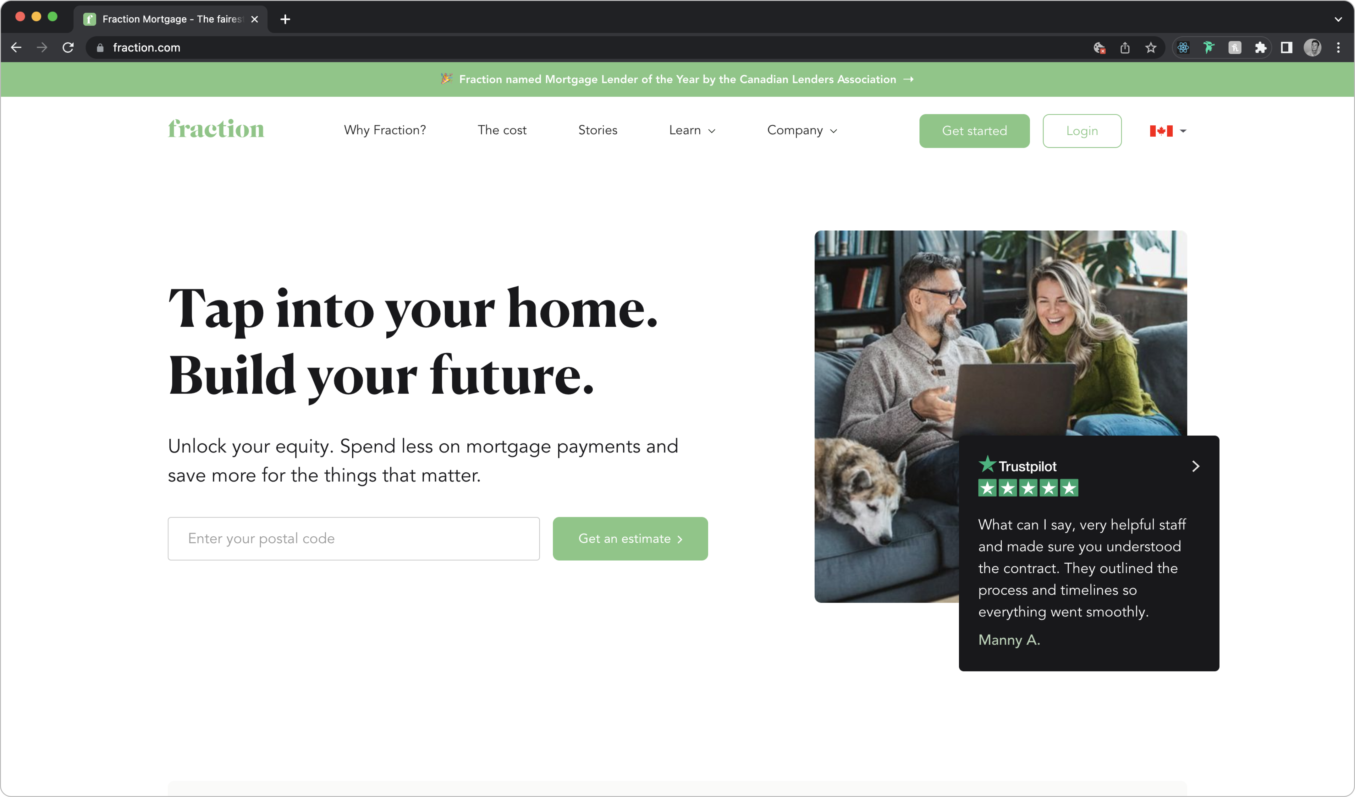
Fraction was a Canadian-based financial startup that provided a new solution for homeowners looking to access their home’s equity without needing to sell or make monthly payments.
Fraction stood out from the traditional Reverse Mortgage and HELOC approaches and gave financial flexibility to those who wanted to:
- Increase their monthly income
- Diversify their wealth
- Pay for large or unexpected expenses
My Specific Role
I was hired as the second product designer and worked alongside my fellow designers Behrouz Salehipour and Taylor Newman on the Product team. Since Fraction was a small start-up, I had to wear many hats as I balanced work on many projects and tasks, namely:
- Designing screens for our website and external/internal dashboards
- Building out component library, style guide and general design system
- Making updates to our live website on Webflow
- Preparing onboarding packages for new employees
- Conducting exploratory interviews to learn about product needs / constraints
- Leading design feedback sessions to ensure current product iterations aligned with stakeholder goals
The Fraction Ecosystem
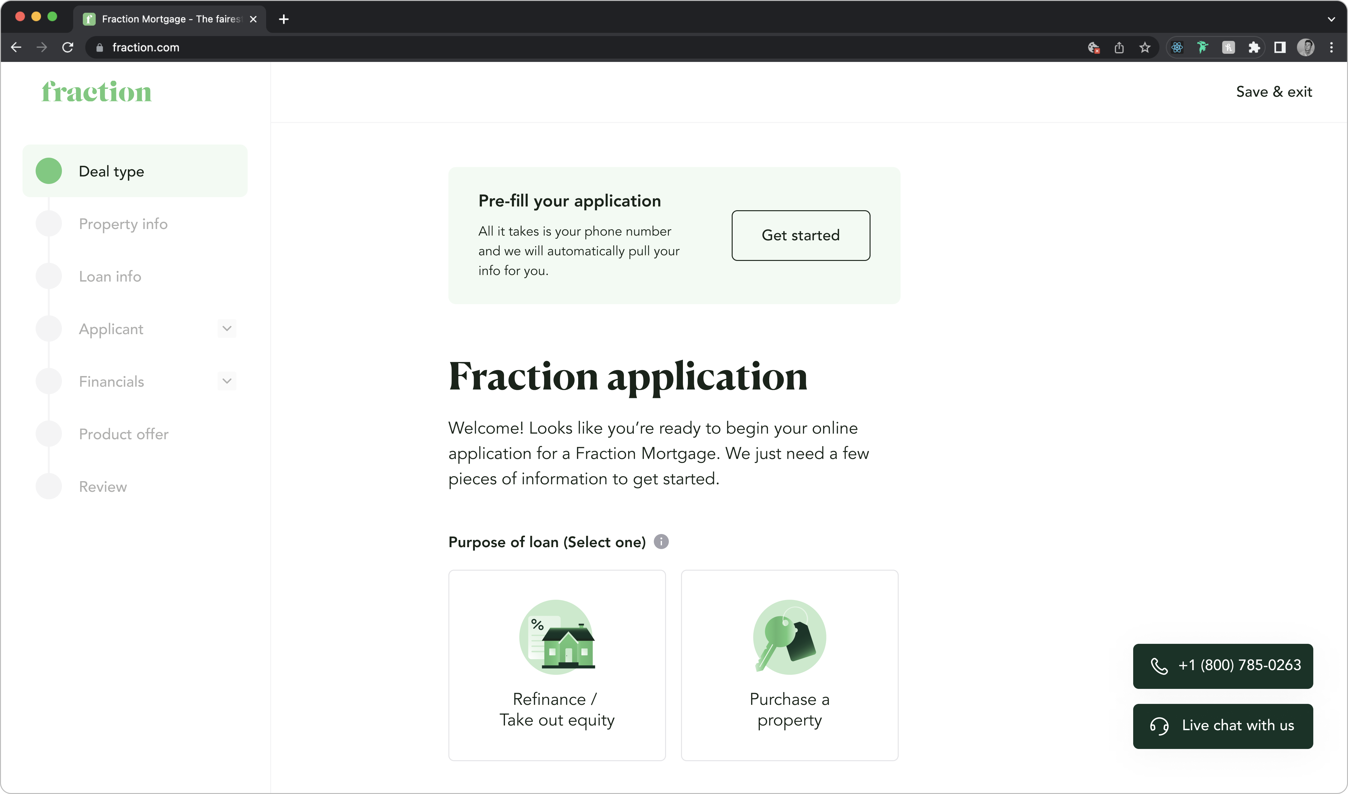
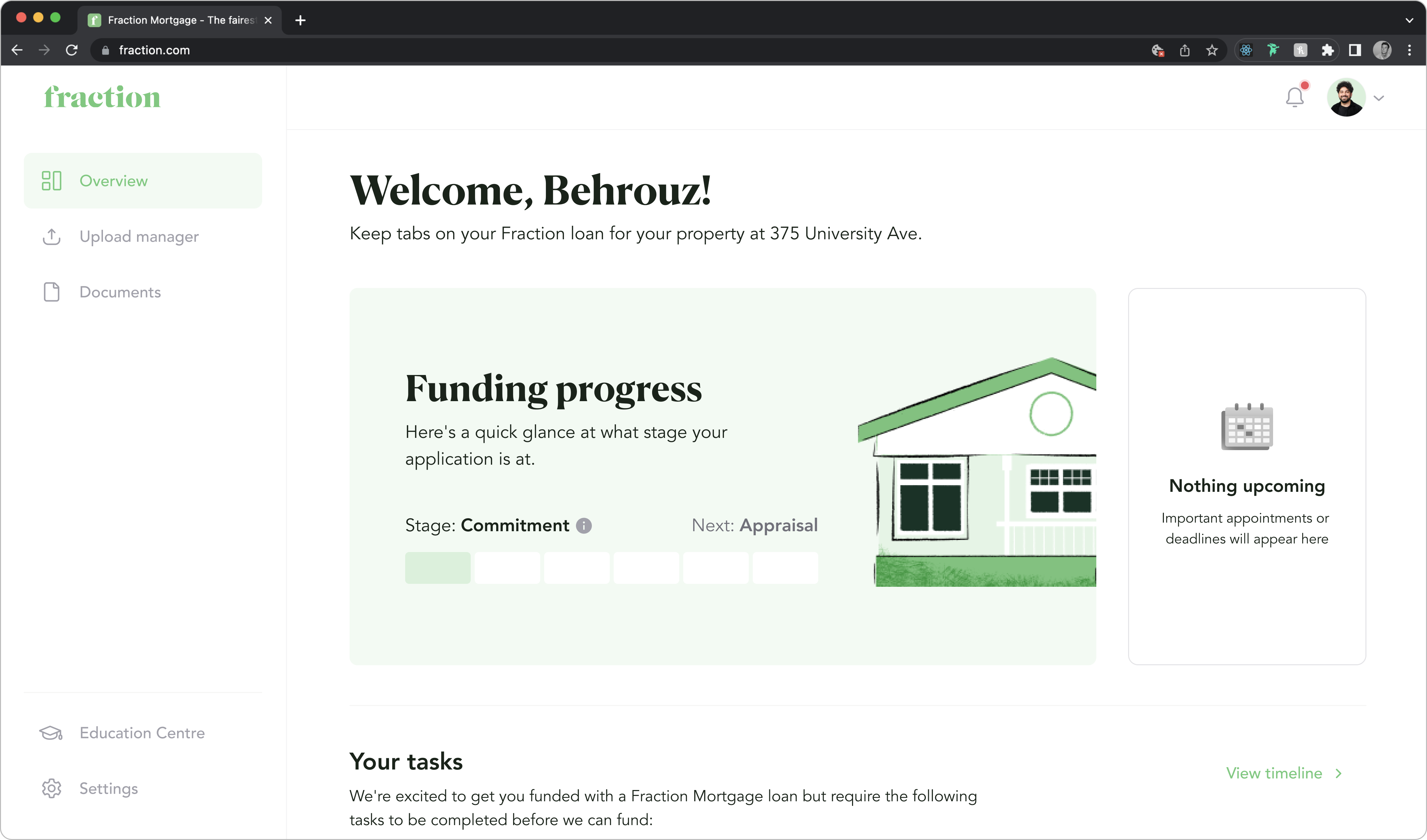
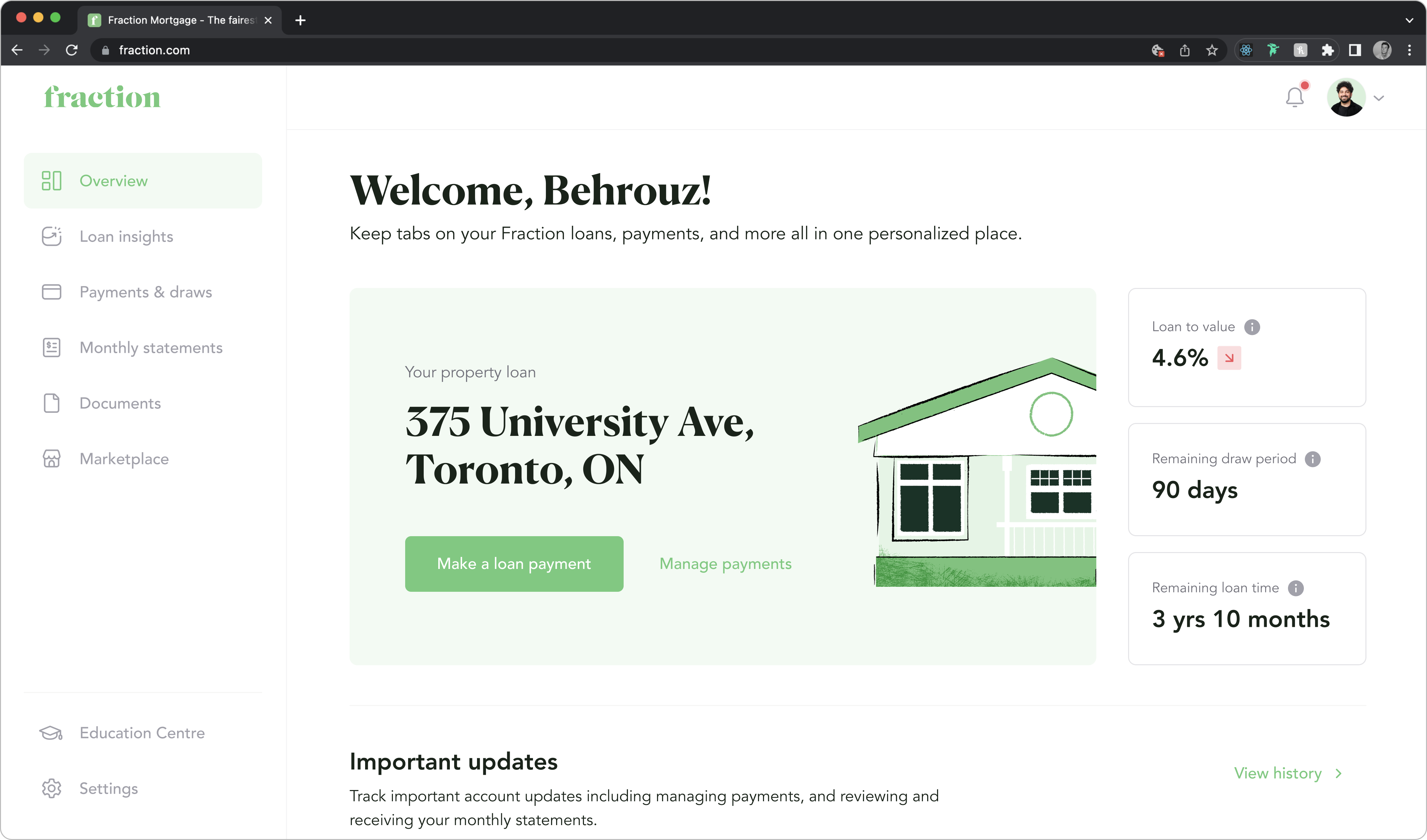
The big focus for my time at Fraction, outside of the Design System (we'll get to that), was building out the end-to-end Fraction Platform. This was a massive undertaking as our platform involved multiple touchpoints for users to complete a variety of actions.
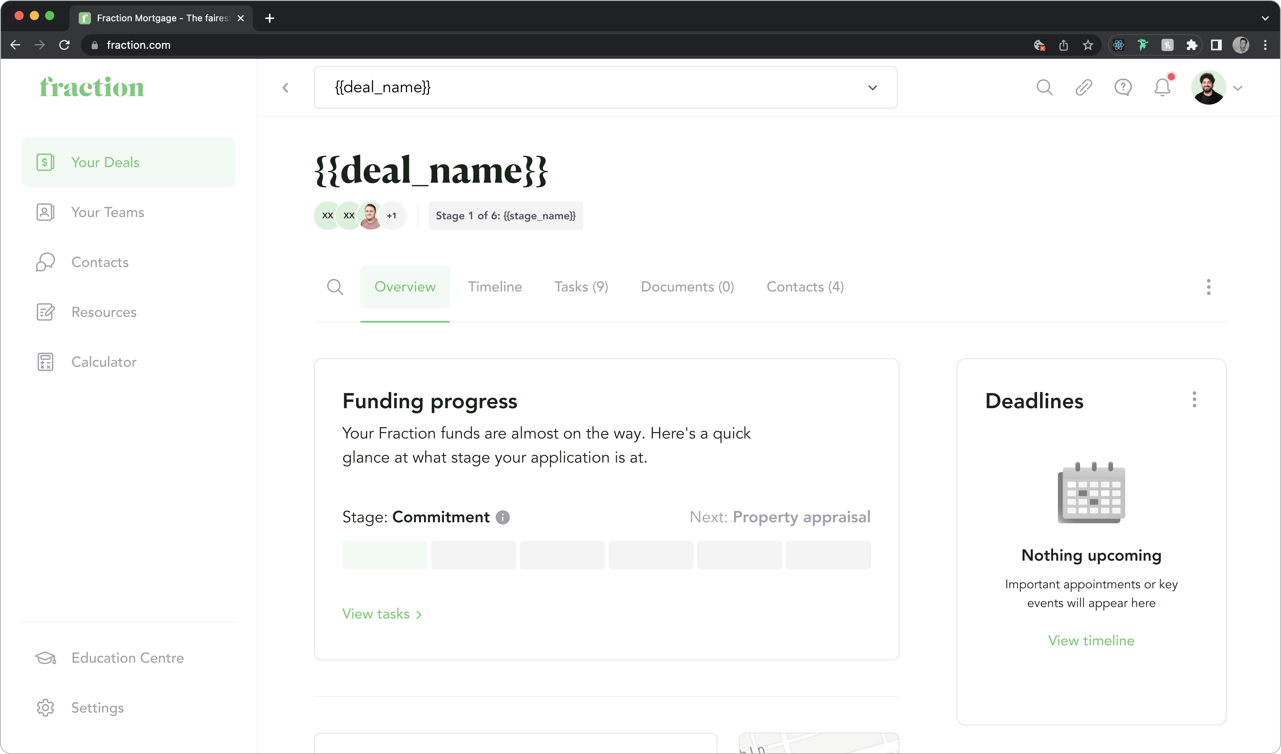
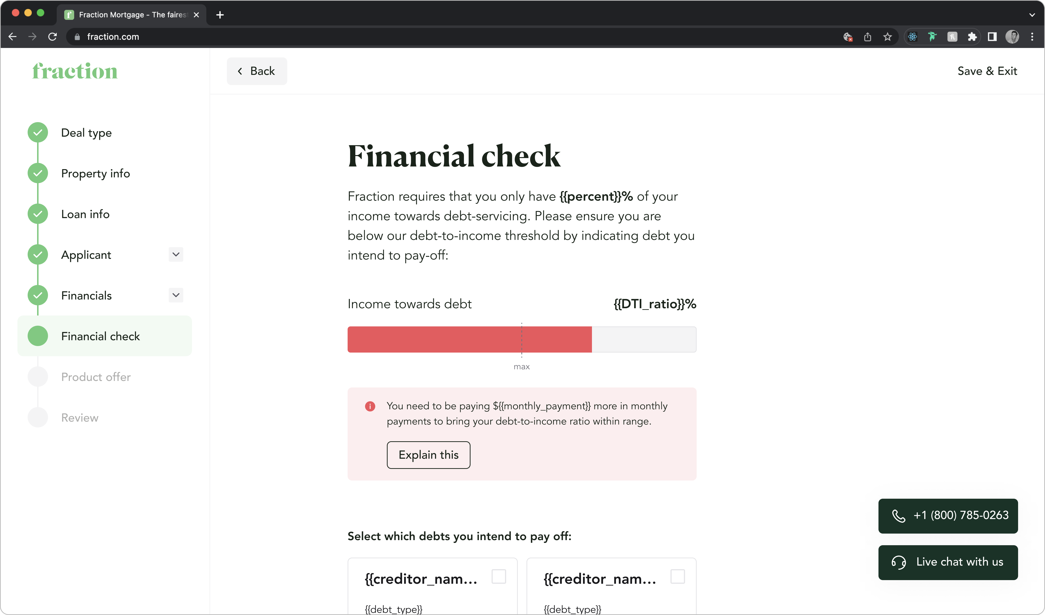
The core flow of this platform focused on enabling borrowers (home owners seeking a loan) to progress through each stage of the funding process. At a high-level, this flow and respective touchpoints I worked on are as follows:
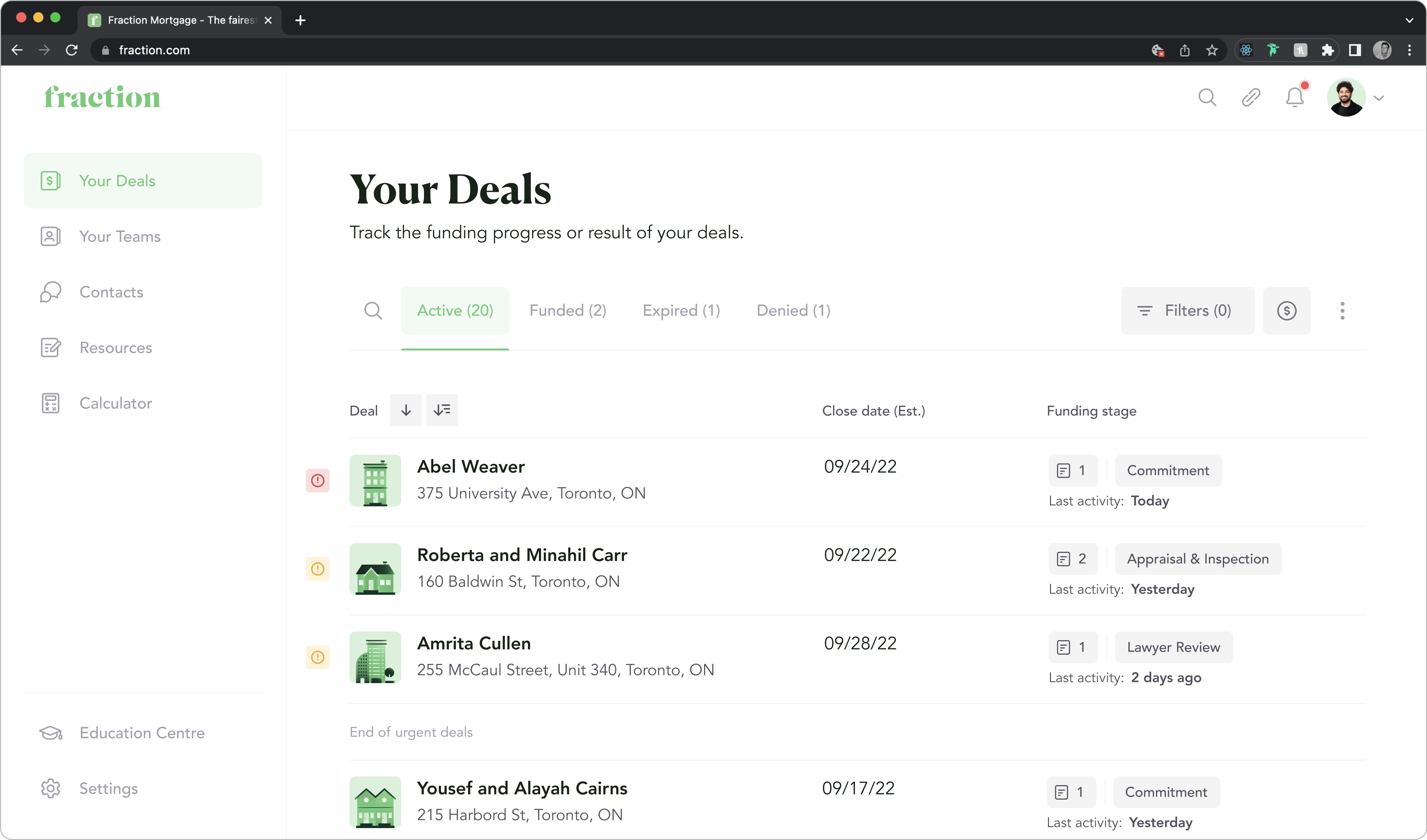
In addition to our borrower-facing dashboard and flow above, we also had dashboards for monitoring the actions of this and other dashboards.
The first is our Broker Dashboard (shown below) for monitoring borrower dashboards and deals, and the other is our LOS (Loan Origination System) for our internal team to oversee everything. The latter was still in the early stages of being designed, so I don't have screens to show, but it would have eventually replaced HubSpot for the team.
Underlying Problem Areas
Our platform seemed straightforward at a glance, but once I began to pull back the layers and learn more about what we were building, a whole host of challenges presented themselves:
1. Location Differences
While Fraction was a "Canadian" company, our product was available for Americans and Canadians, which meant we had to comply with legal requirements depending on where a user was based.
This became increasingly more complicated in the USA as we rolled out to new states, as each state could have drastically different requirements that might require a new screen or just a slight adjustment to a single input. While this might not seem like much, the ramifications would be the need to update an additional slightly different screen/flow for each new place we expanded to.
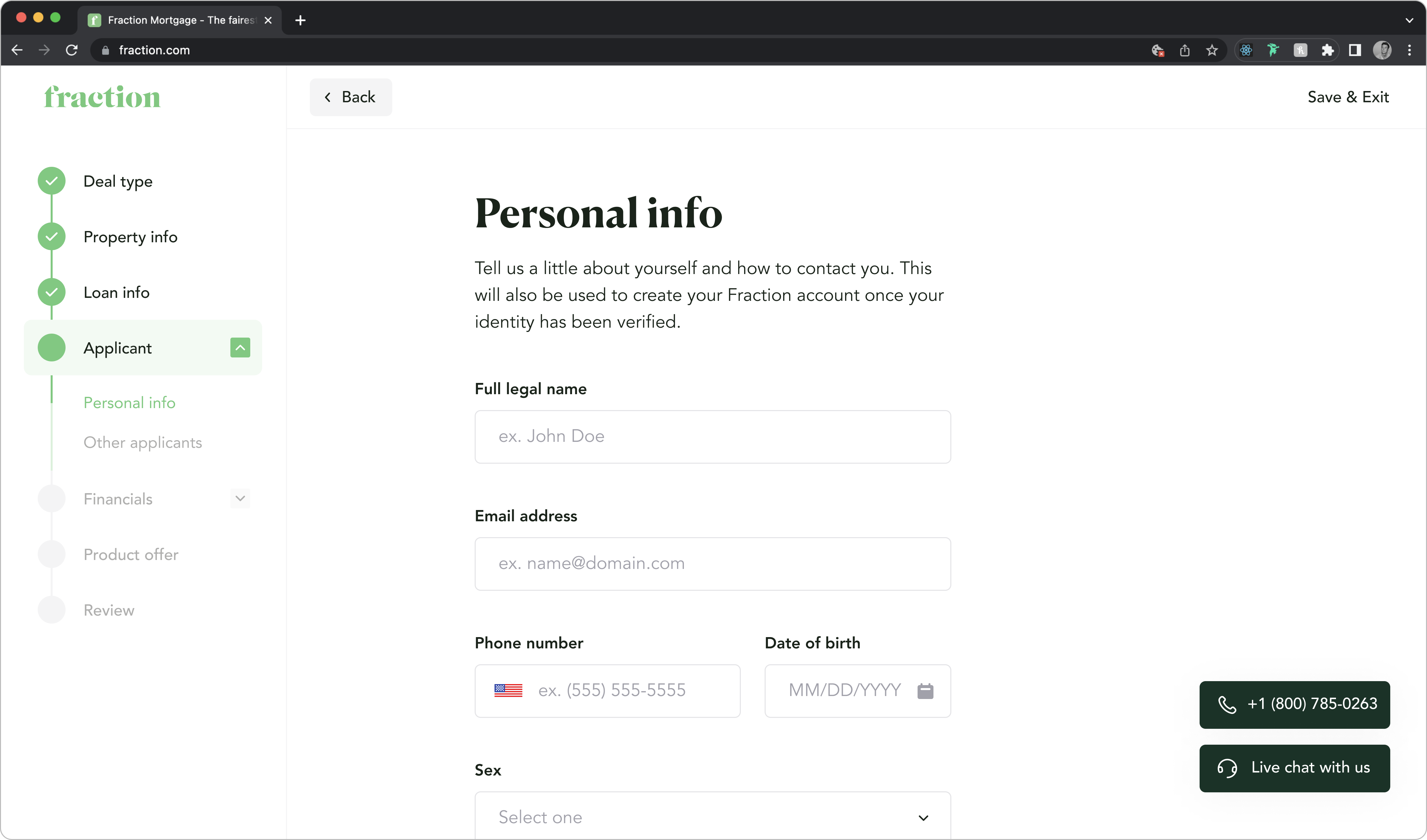
2. Multi-Applicants
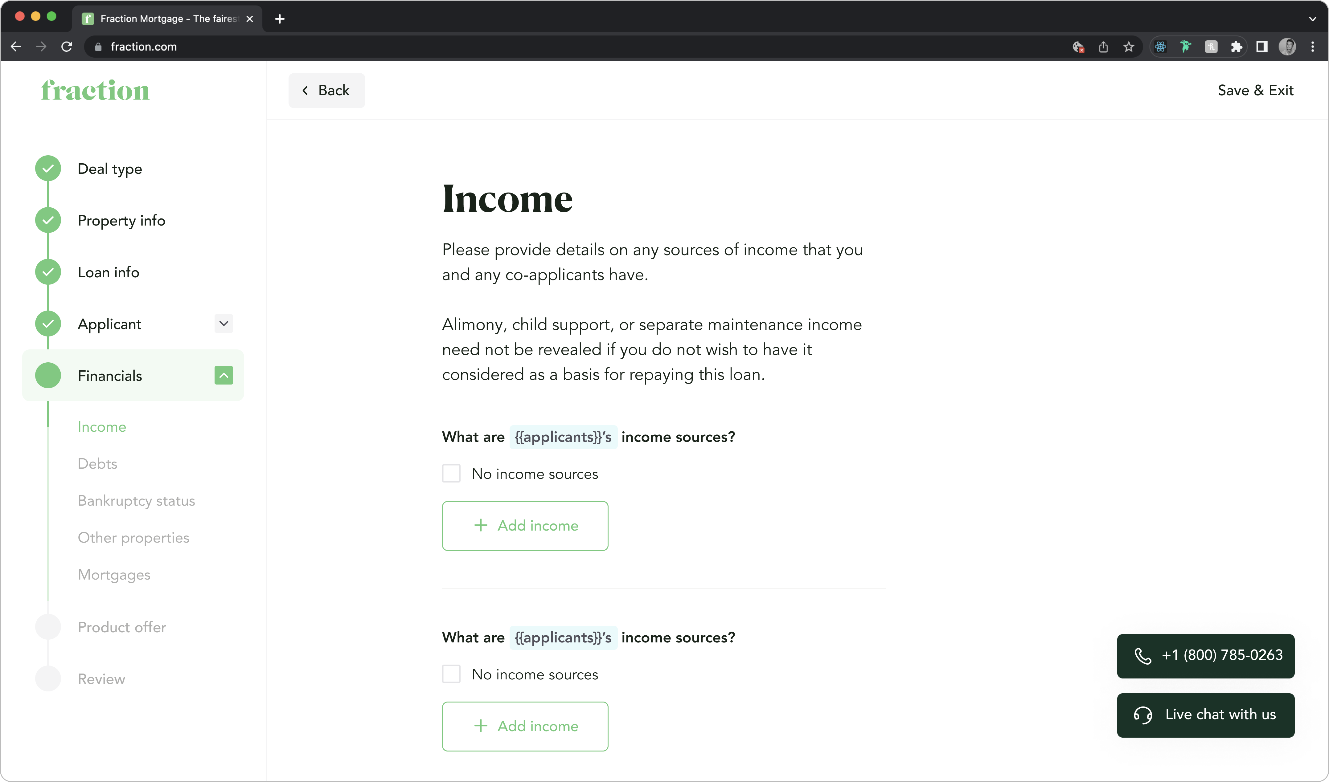
Another area that added complexity to the platform was the potential for multiple applicants on a loan, as it meant each individual had to provide their respective personal and financial info within the application.
The result of this meant additional variants of screens had to be created that could scale to accommodate each added applicant.
3. Shared Content
As mentioned with the Broker Dashboard, brokers can complete funding tasks for borrowers meaning the same (or similar) content and components within a Borrower's dashboard would also exist with the Broker Dashboard.
However, since the designs of these products exist in separate project spaces on Figma, changes to one would only be reflected in the other if done so manually for each instance.
4. Subject to Change
Lastly, with our platform being in the early stages, there was a high likelihood that our designs would need to be adjusted as we gained more insight into product/business needs.
A change like removing a form input or a full screen might not impact too much, but changing the styling of something more far-reaching, like how we handle an interactive state or the layout of a side-nav, could impact countless screens that would waste precious time trying to update to maintain platform-wide design consistency.
Thinking Future-State
Based on the problem areas outlined above, a clear need for the ability to readily make and propagate changes across our platform emerged.
So, before I got too far into designing screens for our platform, I pushed to build out a design system in conjunction with creating our platform as, despite the additional upfront work that it would require, it would allow our team to:
- Establish a single source of truth that current and future team members could reference for design decisions.
- Update granular styles for our brand that can quickly propagate across our platform to ensure consistency in brand look.
- Store built-out components that could later be used/re-used in other product areas for quick high-fidelity prototyping.
After doing some research on what kind of design system could accommodate our specific needs, I landed on a "Headless" Design System to form the foundation for our platform:
Starting from the Bottom
With the reasoning of why Fraction needed a design system out of the way, the question of its exact implementation remains.
Due to the sprawling nature of a Design System, showcasing the actual work can be tricky, as it would look like the Pepe Silvia scene from "It's Always Sunny." So, to illustrate my work, I will outline the underlying building blocks and concepts I used that served as the foundation for each screen using examples of my work, starting the most basic units:
Tokens
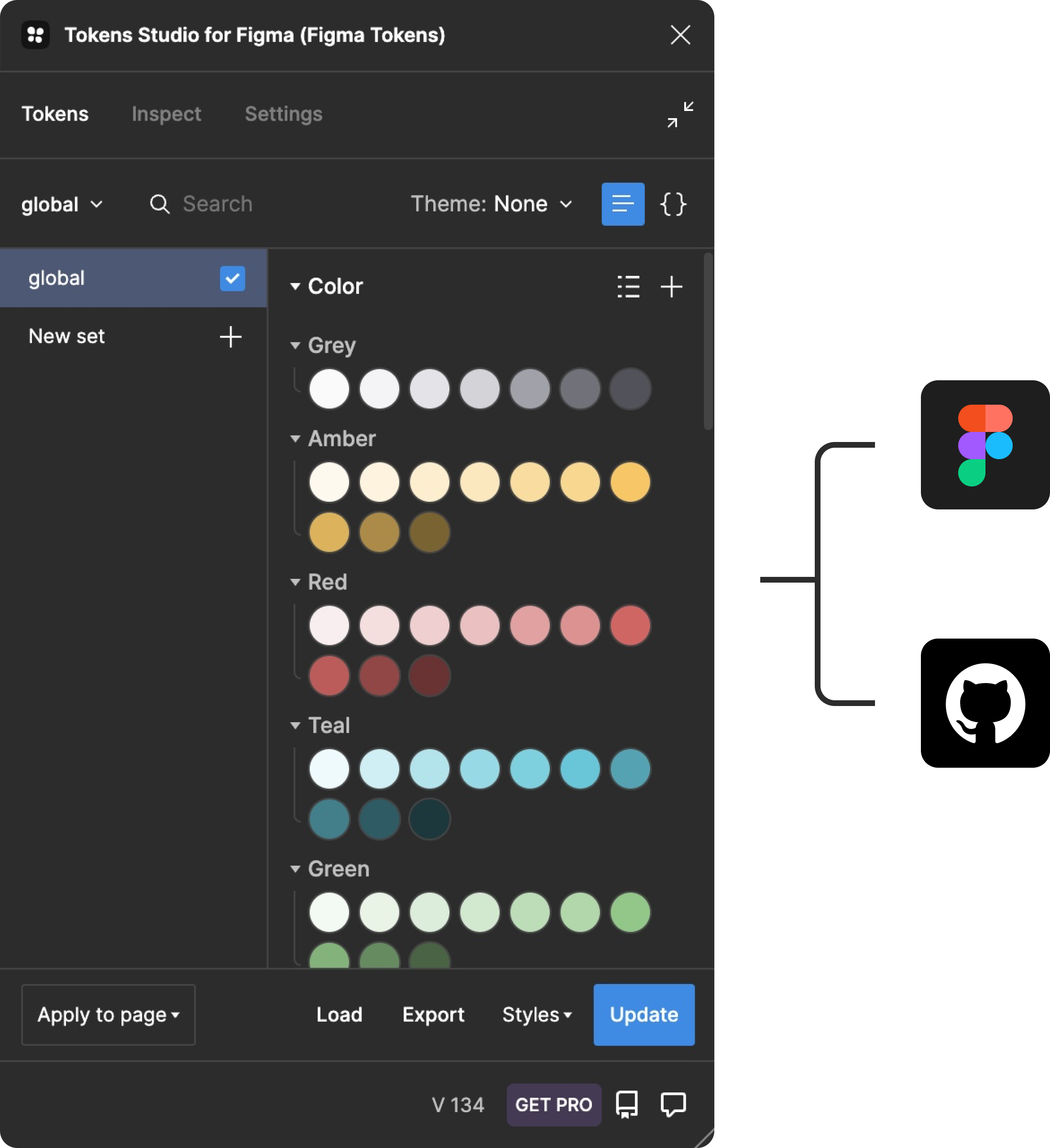
Small design decisions, primarily color palettes, were stored as tokens in the "Figma Tokens" for use in our style guide and designs at Fraction.
While this extension was attached to our Figma account, it was also linked to our Fraction Github to ensure we had a single source of truth across the development hand-off to ensure our teams were in sync and could reference the same core values.
Themes
These tokens were then used as themes to modify our components to fit the specific visual style of our Brand. Usage of these themes could range from simply describing a background or text color, but the combination of multiple themes could be used to form a "Themed" component.
Essentially, our buttons used themes for different elements, such as text, icons, and surfaces, which enabled us to create Fraction-branded buttons. See for yourself:
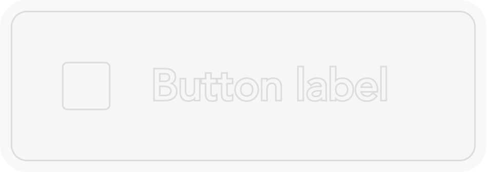
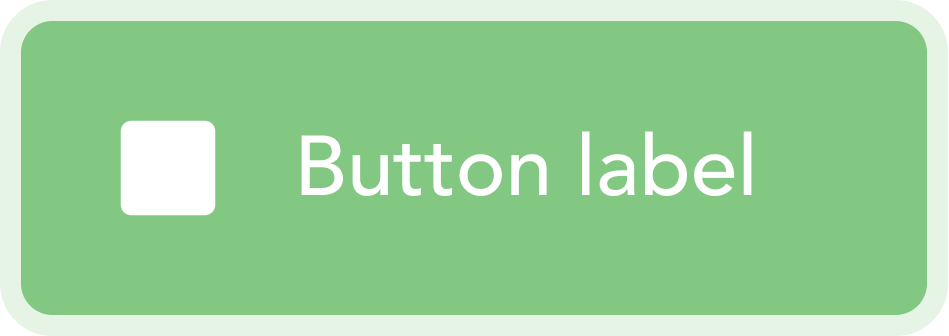
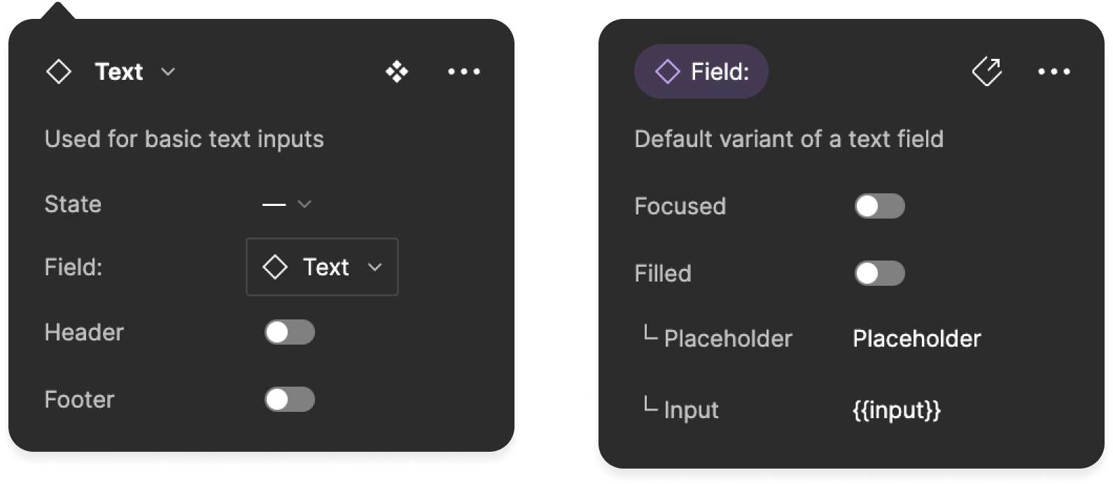
Components
Component attributes like "State" or "Interaction" are then linked to variations of theme usage to form toggleable components. An excellent example of this is our simple text fields (found within our parent input components) that primarily only differ based on theme changes:
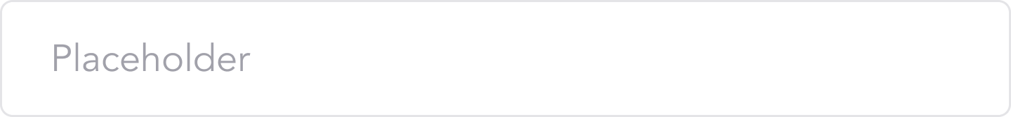
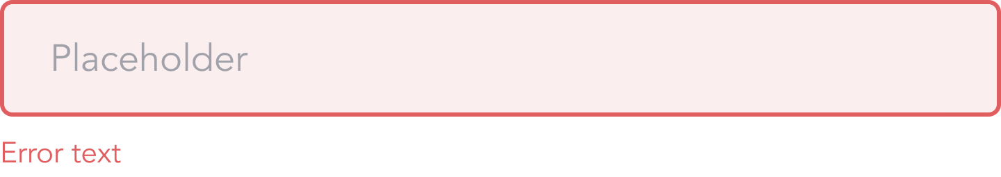
However, our components aren't limited to styling but can also include combinations of nested elements. So, for example, a footer label can be added to our text inputs (above) when in an error state.
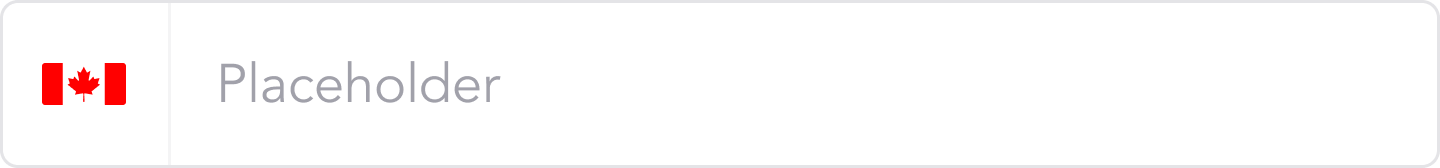
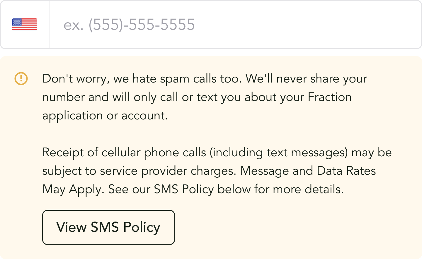
Likewise, different flags can be selected as instances from an illustration library to denote a range of regions for our phone inputs (below) without creating each variation itself, saving us a bunch of time and helping cut down on file size!
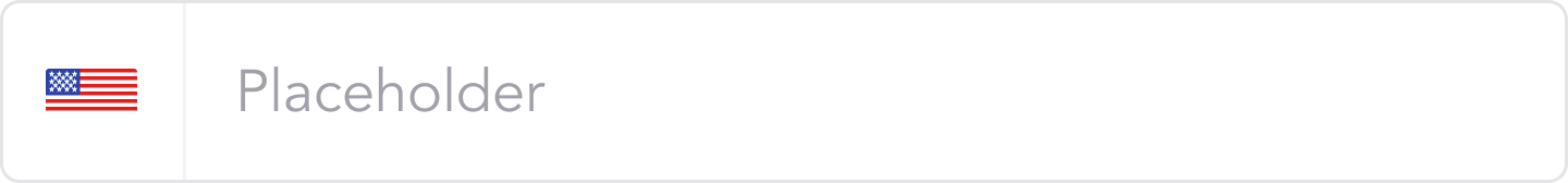
Not needing to create every single component variant is excellent; however, this can become cumbersome if these edited variants are one's we repeatedly use throughout the platform. To solve this issue, components in our design system come in two flavors:
- "Generic" components are base components that can be customized on a case-by-case basis
- "Pattern" components have some pre-built aspects baked-in and require less up-front reworking
Generic components are the ones seen above, but a "Pattern" version of a phone number input could be a variant with a premade disclaimer banner highlighting our SMS policy (below).
By using this type of component, we already have the disclaimer copy baked in that satisfies legal & compliance requirements for US-based applications, so right out of the box, the component is ready to be used in a high-fidelity design.
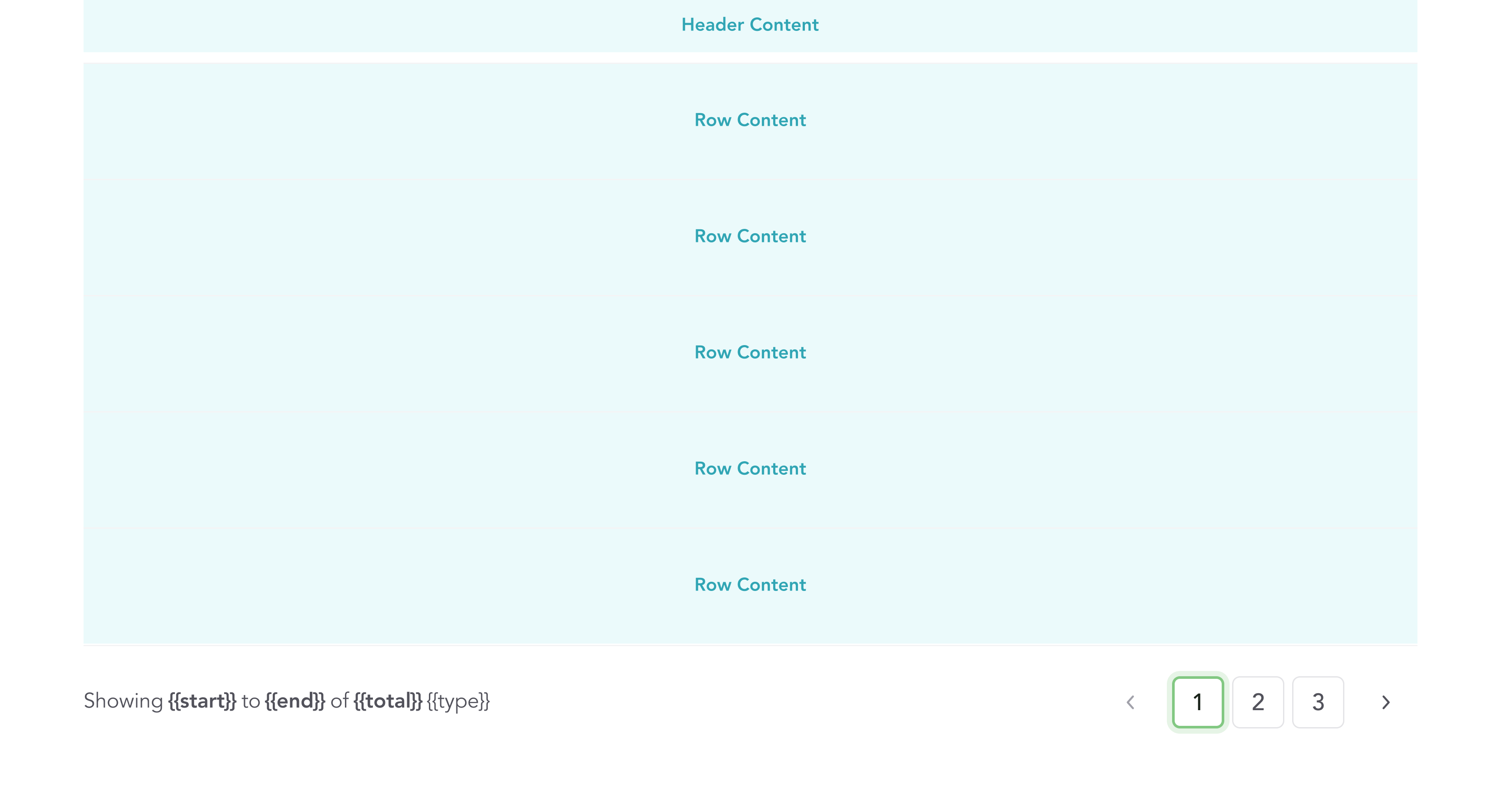
Structures
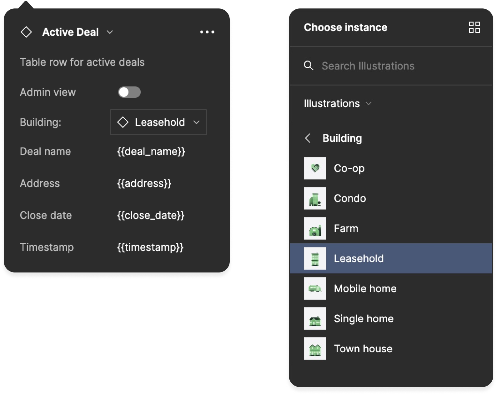
What about complex components that exist in relation to other components, but their content depends on the context of their use? A table comes to mind as their header and row child components don't necessarily have a set "base" state.
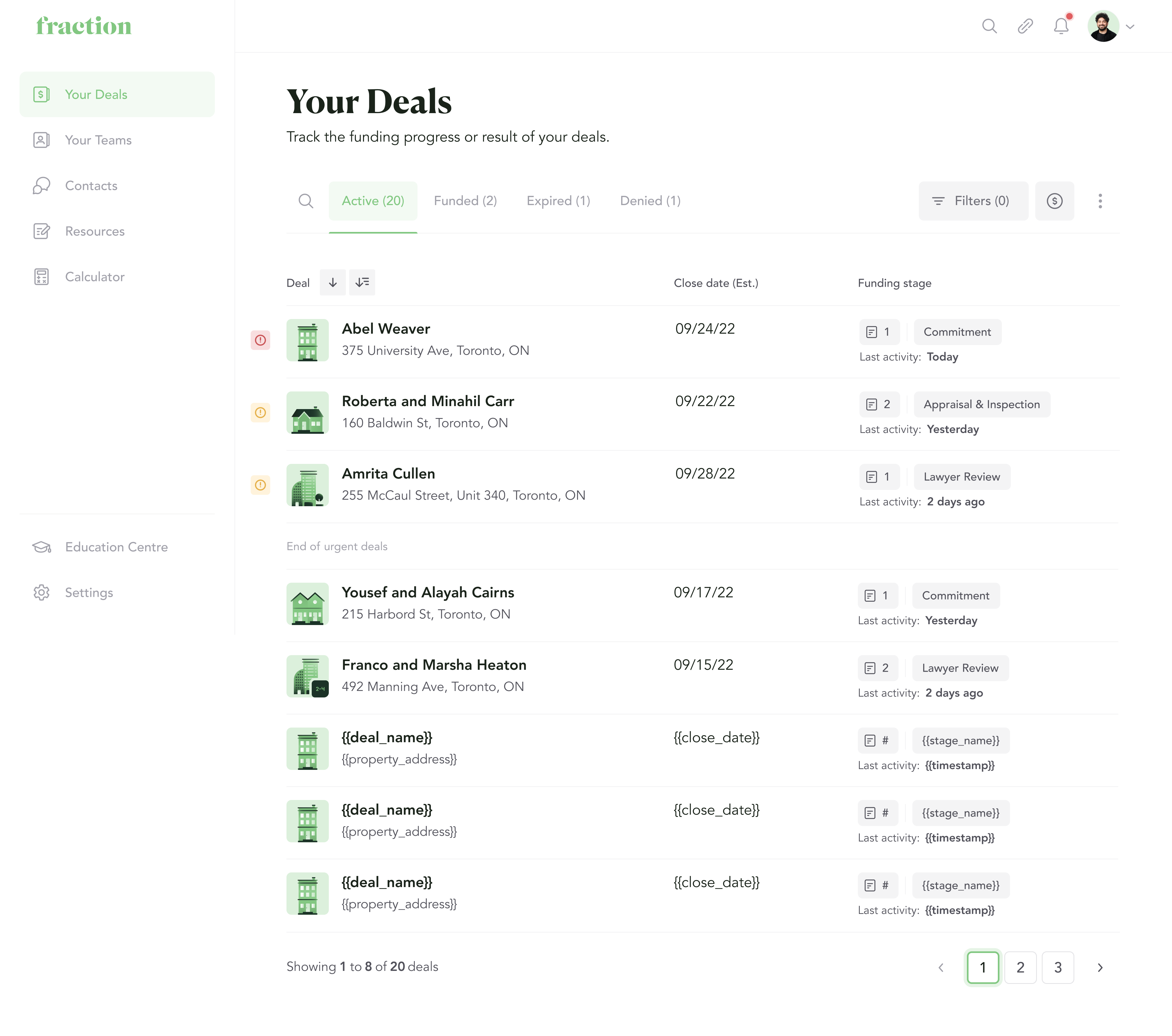
For example, our Broker Dashboards have table rows that showcase different information about an Active deal:

However, information can be presented on a table row differently depending on what tab the broker is on within the "Deal" page, as it relates to the state of a deal:


To solve this potential headache, I utilized "placeholder" variants for some components where base variants aren't as obvious. These components work similarly to the instance swapping shown above but for selecting a starting template of a component before providing additional content.

A combination of these "placeholder" components (and even standard components) form the concept of "structures" within our Design System. To tie this back to tables, table headers and rows use "placeholder" components, while the footer uses the more traditional component as there is a standardized "base" instance.
Screens
Screens takes everything above and allowed us to make a fairly modular UI that is consistent across our full-platform, regardless of who is designing it.
Flows
Lastly we have Flows which strung together screens to create click-able prototypes for use in highlighting a cross section of the platform or a specific user flow/feature.
Due to the Fraction platform still being in its infancy at the time of working on these flows, they were largely used in feedback sessions and were representative of a work-in-progress. That said, I recorded a quick video to demonstrate the fidelity in which I was working and to showcase how all of this comes together, in action:
What I Learned
I had a wonderful time at Fraction as everyone I worked with was extremely welcoming and were always open to chatting with me whenever I reached out looking to learn more about their repsective workflows or to gain feedback on something I was working on.
Since this was my first full-time work experience in a tech start-up, the job/work was daunting at times, but I appreciate the team for putting their faith in me as a designer and allowing me to take lead on projects and make big decisions (like spearhead our Design System).
While it wasn't a straightforward journey, their faith in me to get the job done enabled me to gain this unique experience in building a Design System from scratch and has led me towards looking for similar experiences in the future.
Our Future Plans
Unfortunately, my time at Fraction was cut short as our company closed in January of 2023 meaning all of the foundational work that was started couldn't be completed. That said, we had been working towards Fraction's future since the beginning and had the following planned.
Short-term
When I had begun work on our "Design System" and "Component Library", I had banked on Figma adding the ablity to pass values (props) down to nested (child) components, like in a development setting, as it would allow for greater reusability and rely less on click-through.
Luckily, this gambit would have paid off as Figma recently added the ability to "expose" nested instances of components to allow easy access from a top-level (parent) component. Therefore, my next step would have been updating specific components to leverage this feature:
Long-term
Looking further, we had plans to improve how our design work impacted and interacted with the company at-large. Namely, we had plans to focus more on the following areas:
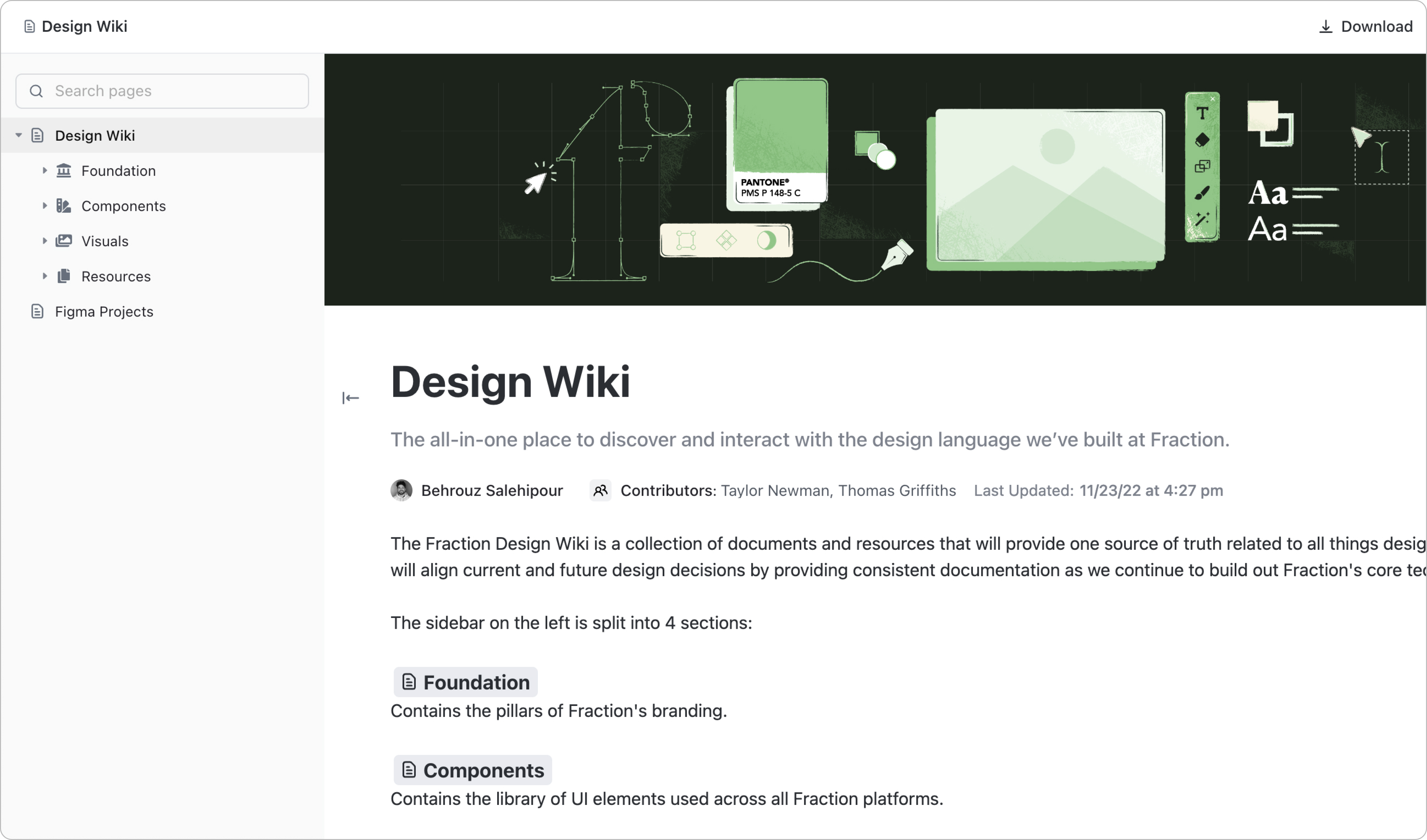
- Design Wiki
- Development Handoff
- A / B Testing